TreeList creates a selection based hierarchical tree UI component that is connected to multiple database fields. It can support single as well as multiple item selections.
Example uses:
- select category/ subcategory items from a list of categories in an e-commerce website.
Usage
Basic Usage
    <TreeList
        componentId="treeListSensor"
        dataField={['class.keyword', 'subClass.keyword']}
        title="Products"
    />
Usage With All Props
<TreeList
title="TreeList Component"
loader={<h3>loading...⏰</h3>}
renderNoResults={() => <b>Oops! Nothing found!</b>}
componentId="treeListSensor"
showCount
// showRadio // use with mode="single"
showCheckbox
mode="multiple"
dataField={['class.keyword', 'subClass.keyword']}
showSwitcherIcon
switcherIcon={bool =>
{
return bool ? <span> ←</span> : <span> ↖</span>;
}
}
showIcon
showLeafIcon
icon={
<span role="img" aria-label="folder-icon">
🦷
</span>
}
leafIcon={
<span role="img" aria-label="leaf-icon">
☘️
</span>
}
showLine
showSearch
// renderItem={(label, count, isSelected) => (
// <span style={isSelected ? { background: 'green' } : {}}>
// {label} - {count}
// </span>
// )}
// render={(propData) => {
// const {
// /* eslint-disable no-unused-vars */
// data,
// rawData,
// error,
// handleClick,
// value,
// loading,
// } = propData;
// return this.renderLists(data, '', true, value, handleClick);
// }}
endpoint={{
url:"https://appbase-demo-ansible-abxiydt-arc.searchbase.io/recipes-demo/_reactivesearch.v3", //mandatory
headers:{
// relevant headers
},
method: 'POST'
}}
/>Usage as a controlled component
function Index(props) {
	const [values, setValues] = useState([
  "FURNITURE SO > SO CHAIR &RECLIN",
  "FURNITURE SO > SO DINING ROOM"
]);
    return (
        <TreeList
            componentId="treeListSensor"
            dataField={['class.keyword', 'subclass.keyword']}
            size={100}
            value={values}
            onChange={(values)=>{
                setValues(values);
            }}
        />
    );
}
Props
-
componentId
Stringunique identifier of the component, can be referenced in other components'reactprop. -
endpoint
Object[optional] endpoint prop provides the ability to query a user-defined backend service for this component, overriding the data endpoint configured in the ReactiveBase component. Works only whenenableAppbaseistrue. Accepts the following properties:- url
String[Required] URL where the data cluster is hosted. - headers
Object[optional]
set custom headers to be sent with each server request as key/value pairs. - method
String[optional]
set method of the API request. - body
Object[optional]
request body of the API request. When body isn't set and method is POST, the request body is set based on the component's configured props.
- Overrides the endpoint property defined in ReactiveBase.
- If required, use
transformResponseprop to transform response in component-consumable format.
- url
-
dataField
String Arraydata field to be connected to the component's UI view. This field is used for doing an aggregation and returns the result.dataFieldaray must have values in order, i.e, category > sub-cateogry and so-on. -
title
String or JSX[optional] title of the component to be shown in the UI. Defaults to no title being shown. -
loader
String or JSX[optional] to display an optional loader while fetching the options. -
aggregationSize To set the number of buckets to be returned by aggregations.
Note: This prop is only applicable when
enableAppbaseis set totrue. -
sortBy
String[optional] sort the list items by one ofcount,asc, ordesc. Defaults tocount, which sorts the list by the frequency of count value, most first. -
defaultValue
String Array[optional] select one or more options from the list on mount. Accepts anArrayobject containing the items that should be selected. -
value
String Array[optional] controls the current value of the component. It selects the item from the list (on mount and on update). Use this prop in conjunction withonChangefunction. -
queryFormat
String[optional] queries the selected items from the list in one of two modes:or,and.- Defaults to
orwhich queries for results where any of the selected list items are present. - In
andmode, the applied query filters results where all of the selected items are present.
- Defaults to
-
mode
String[optional] supports two modes,multipleandsingle. When set tosingle, only one selection from the hierarchy is allowed. Defaults tomultiple. -
showCheckbox
Boolean[optional] show checkbox icon for each list item. Defaults tofalse.Use this prop in conjunction withmodeprop set tomultiple. -
showRadio
Boolean[optional] show radio icon for each list item. Defaults tofalse.Use this prop in conjunction withmodeprop set tosingle. -
showCount
Boolean[optional] show a count of the number of occurences besides each list item. Defaults totrue. -
showIcon
Boolean[optional] show icon for non-leaf hierarchy items. Defaults tofalse. -
icon
JSX[optional] custom icon for non-leaf hierarchy items.icon={ <span role="img" aria-label="folder-icon"> 🦷 </span> } -
showLeafIcon
Boolean[optional] show icon for leaf hierarchy items. Defaults tofalse. -
leafIcon
JSX[optional] custom icon for leaf hierarchy items.icon={ <span role="img" aria-label="leaf-icon"> 🥬 </span> } -
showSwitcherIcon
Boolean[optional] show switcher icon for TreeList. -
switcherIcon
Function[optional] custom switcher icon for TreeList. It takes an boolean argument to depict expanded/ collapsed list item.switcherIcon={isExpanded => (isExpanded ? <span> ⤵</span> : <span> →</span>)} -
showSearch
Boolean[optional] whether to show a searchbox to filter the list items locally. Defaults to true. -
placeholder
String[optional] placeholder to be displayed in the searchbox, only applicable when theshowSearchprop is set totrue. When applicable, the default placeholder value is set to "Search". -
showFilter
Boolean[optional] show as filter when a value is selected in a global selected filters view. Defaults totrue. -
filterLabel
String[optional] An optional label to display for the component in the global selected filters view. This is only applicable ifshowFilteris enabled. Default value used here iscomponentId. -
URLParams
Boolean[optional] enable creating a URL query string parameter based on the selected value of the list. This is useful for sharing URLs with the component state. Defaults tofalse. -
renderItem
Function[optional] customize the rendered list itemss via a function which receives the item label, count & isSelected and expects a JSX or String back. For example:renderItem={(label, count, isSelected) => ( <span style={isSelected ? { background: 'green' } : {}}> {label} - {count} </span> )} -
render
Function[optional] an alternative callback function torenderItem, where user can define how to render the view based on all the data changes.
It accepts an object with these properties:loading:booleanindicates that the query is still in progresserror:objectAn object containing the error infodata:arrayAn array of results obtained from the applied query and transformed into component consumable format.rawDataobjectAn object of raw response as-is from elasticsearch query.value:arraycurrent selected values.handleClick:functionA callback function can be used to mark the list value as selected. Accepts the list item label and parent-path of the current item, eg, in "Tree > Branch > Leaf" the parent-path of 'Leaf' would be 'Tree.Branch'.
    const recLookup = (obj, path) => {
        try {
            const parts = path.split('.');
            if (parts.length === 1) {
                return obj[parts[0]];
            }
            return recLookup(obj[parts[0]], parts.slice(1).join('.'));
        } catch (e) {
            return false;
        }
    };

	function renderListItems(listItem, parentPath, selectedValues, handleListItemClick) {
		if (!(listItem instanceof Object) || Object.keys(listItem).length === 0) {
			return null;
		}
		const listItemLabel = listItem.key;
		const listItemCount = listItem.count;
		const isLeafNode = !(Array.isArray(listItem.list) && listItem.list.length > 0);

		let newParentPath = listItemLabel;
		if (parentPath) {
			newParentPath = `${parentPath}.${listItemLabel}`;
		}
		const isSelected = recLookup(selectedValues, newParentPath);

		return (
			<li key={newParentPath}>
				{/* eslint-disable jsx-a11y/click-events-have-key-events */}
				{/* eslint-disable jsx-a11y/no-static-element-interactions */}
				<span
					style={isSelected ? { background: 'green', margin: '5px 0' } : {}}
					onClick={() => handleListItemClick(listItemLabel, parentPath, isLeafNode)}
				>
					<React.Fragment>
						<span>{listItemLabel}</span>

						<span>{listItemCount}</span>
					</React.Fragment>
				</span>
				{isLeafNode === false && (
					<div className="--list-child">
						{/* eslint-disable-next-line no-use-before-define */}
						{renderLists(
							listItem.list,
							newParentPath,
							isSelected,
							selectedValues,
							handleListItemClick,
						)}
					</div>
				)}
			</li>
		);
	}

	function renderLists(
            transformedData,
            parentPath,
            isExpanded,
            selectedValues,
            handleClick
        ) {
            return (
                <ul style={isExpanded ? { fontWeight: 600 } : {}}>
                    {transformedData.map(listItem =>
                        renderListItems(
                            listItem,
                            parentPath,
                            selectedValues,
                            handleClick
                        ),
                    )}
                </ul>
            );
        }

<TreeList
    //... other props as applicable
	render={(propData) => {
		const {
			/* eslint-disable no-unused-vars */
			data,
			rawData,
			error,
			handleClick,
			value,
			loading,
		} = propData;
		return renderLists(data, '', true, vhandleClick); // renderLists is your list rendering function
	}}
/>
Or you can also use render function as children
<TreeList>
    {
        ({
            data,
            rawData,
            error,
            handleClick,
            value,
            loading
        }) => (
            // return UI to be rendered
        )
    }
</TreeList>-
renderError
String or JSX or Function[optional] can be used to render an error message in case of any error.renderError={(error) => ( <div> Something went wrong!<br/>Error details<br/>{error} </div> ) } -
renderNoResults
Function[optional] can be used to render a message in case of no list items.renderNoResults={() => <p>No Results Found!</p>} -
onChange
function[optional] is a callback function which accepts component's current value as a parameter. It is called when you are using thevalueprops and the component's value changes. This prop is used to implement the controlled component behavior. -
onError
Function[optional] gets triggered in case of an error and provides theerrorobject, which can be used for debugging or giving feedback to the user if needed. -
index
String[optional] The index prop can be used to explicitly specify an index to query against for this component. It is suitable for use-cases where you want to fetch results from more than one index in a single ReactiveSearch API request. The default value for the index is set to theappprop defined in the ReactiveBase component.Note: This only works when
enableAppbaseprop is set to true inReactiveBase.
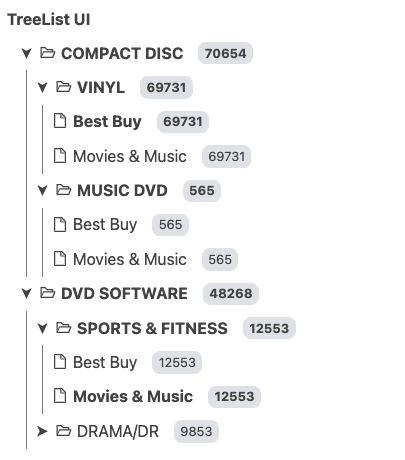
Demo
Styles
TreeList component supports innerClass prop with the following keys:
titleinputcheckboxradiolabelcount
Read more about it here.
Extending
TreeList component can be extended to
- customize the look and feel with
className,style, - update the underlying DB query with
customQuery,defaultQuery, - connect with external interfaces using
beforeValueChange,onValueChangeandonQueryChange, - specify how options should be filtered or updated using
reactprop.
<TreeList
  // ...
  className="custom-class"
  style={{"paddingBottom": "10px"}}
  customQuery={
    function(value, props) {
      return {
        query: {
            match: {
                data_field: ["this is a test"]
            }
        }
      }
    }
  }
  defaultQuery={
    function(value, props) {
      return {
          timeout: "1s"
      }
    }
  }
  beforeValueChange={
    function(value) {
      // called before the value is set
      // returns a promise
      return new Promise((resolve, reject) => {
        // update state or component props
        resolve()
        // or reject()
      })
    }
  }
  onValueChange={
    function(value) {
      console.log("current value: ", value)
      // set the state
      // use the value with other js code
    }
  }
  onQueryChange={
    function(prevQuery, nextQuery) {
      // use the query with other js code
      console.log('prevQuery', prevQuery);
      console.log('nextQuery', nextQuery);
    }
  }
  // specify how and which options are filtered using `react` prop.
  react={
    "and": ["pricingFilter", "dateFilter"],
    "or": ["searchFilter"]
  }
/>-
className
StringCSS class to be injected on the component container. -
style
ObjectCSS styles to be applied to the TreeList component. -
customQuery
Functiontakes value and props as parameters and returns the data query to be applied to the component, as defined in Elasticsearch Query DSL.Note:customQuery is called on value changes in the TreeList component as long as the component is a part ofreactdependency of at least one other component.Note:When extending with customQuery, thequeryFormatprop has no affect. -
defaultQuery
Functiontakes value and props as parameters and returns the data query to be applied to the source component, as defined in Elasticsearch Query DSL, which doesn't get leaked to other components. Read more about it here. -
beforeValueChange
Functionis a callback function which accepts component's future value as a parameter and returns a promise. It is called every time before a component's value changes. The promise, if and when resolved, triggers the execution of the component's query and if rejected, kills the query execution. This method can act as a gatekeeper for query execution, since it only executes the query after the provided promise has been resolved.Note:
If you're using Reactivesearch version >=
3.3.7,beforeValueChangecan also be defined as a synchronous function.valueis updated by default, unless you throw anErrorto reject the update. For example:beforeValueChange = values => { // The update is accepted by default if (values.includes('Dirk Pitt')) { // To reject the update, throw an error throw Error('Selected values should not include Dirk Pitt.'); } }; -
onValueChange
Functionis a callback function which accepts component's current value as a parameter. It is called everytime the component's value changes. This prop is handy in cases where you want to generate a side-effect on value selection. For example: You want to show a pop-up modal with an applicable discount coupon code when list item(s) is/are selected in a "E-commerce Product" TreeList. -
onQueryChange
Functionis a callback function which accepts component's prevQuery and nextQuery as parameters. It is called everytime the component's query changes. This prop is handy in cases where you want to generate a side-effect whenever the component's query would change. -
react
Objectspecify dependent components to reactively update TreeList's options.- key
Stringone ofand,or,notdefines the combining clause.- and clause implies that the results will be filtered by matches from all of the associated component states.
- or clause implies that the results will be filtered by matches from at least one of the associated component states.
- not clause implies that the results will be filtered by an inverse match of the associated component states.
- value
String or Array or ObjectStringis used for specifying a single component by itscomponentId.Arrayis used for specifying multiple components by theircomponentId.Objectis used for nesting other key clauses.
- key


